Infographic on Arms Transfers (updated 2019)
We’ve updated our infographic on Arms Transfer with the new data released by SIPRI in March 2020 with figures of 2019.
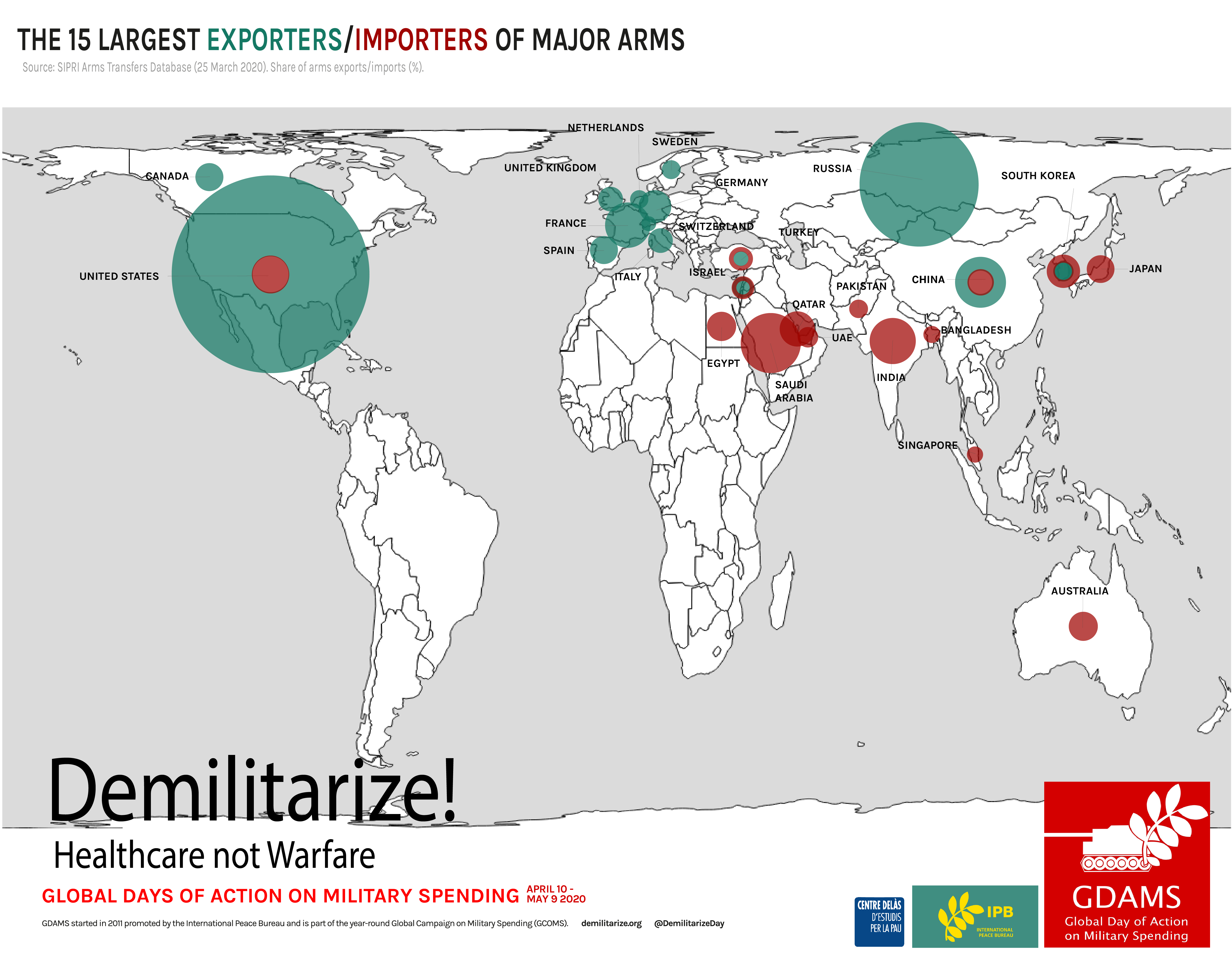
This infographic uses data from SIPRI’s Arms Transfers Database, and displays arms trade through bubbles on a world map representing proportionally the 15 largest importers and exporters of major arms.
It seemed relevant to us how the biggest exporters (in turquoise) are mostly in Northern countries and how importers (in red) are mainly in the South. Weapons flow therefore from North to South, which proves the the responsibility of Northern exporters in tensions and conflicts around the world, that ultimately generate enormous suffering and instability.
This intends to show connections among countries and to point fingers at those states selling weapons to others involved in conflicts, tensions and/or systematically violating human rights.
International transfers of major arms during the five-year period 2015–19 increased by 5.5 per cent compared with 2010–14. According to new data from the Stockholm International Peace Research Institute (SIPRI), the largest exporters of arms during the past five years were the United States, Russia, France, Germany and China. The new data shows that the flow of arms to the Middle East has increased, with Saudi Arabia clearly being the world’s largest importer.
See the infographics with 2018 figures here