Infographic Military Spending GDAMS 2019
On the occasion of GDAMS 2019 we prepared 2 infographics, one about the biggest military spenders and another one about arms transfers.
Please feel free to use them and share them so we can get the word out on the nonsense of militarization and warmongering!
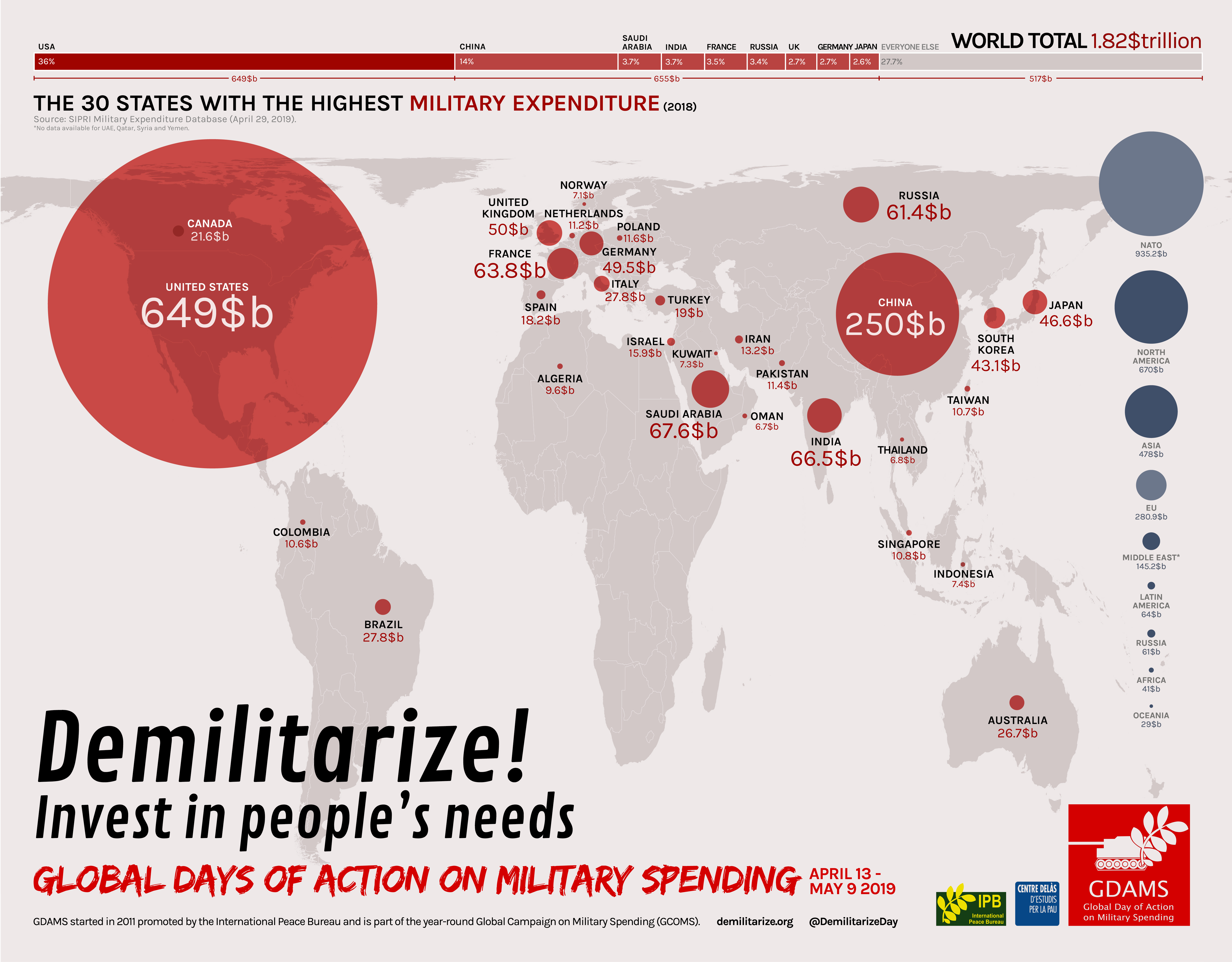
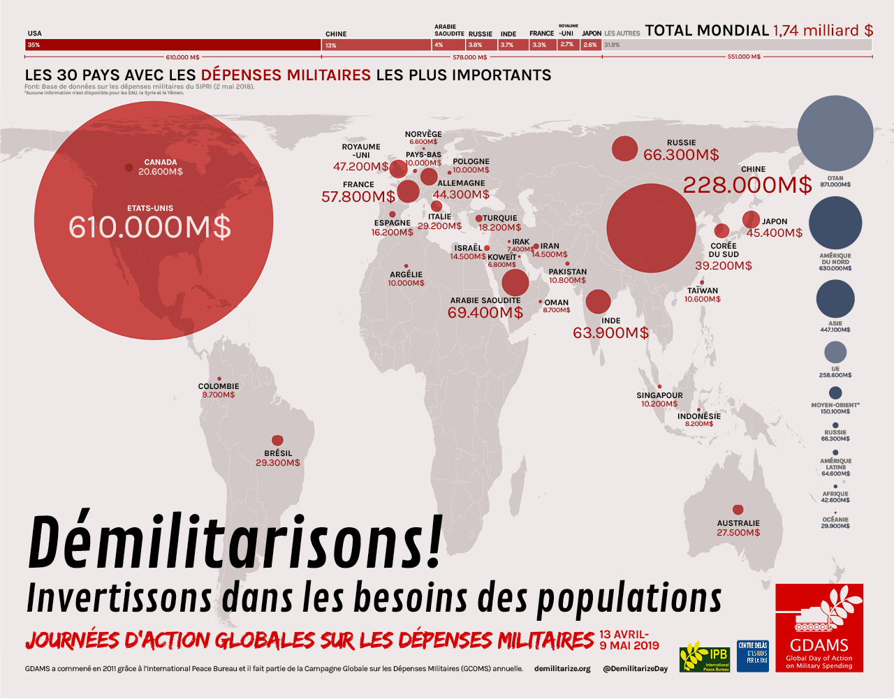
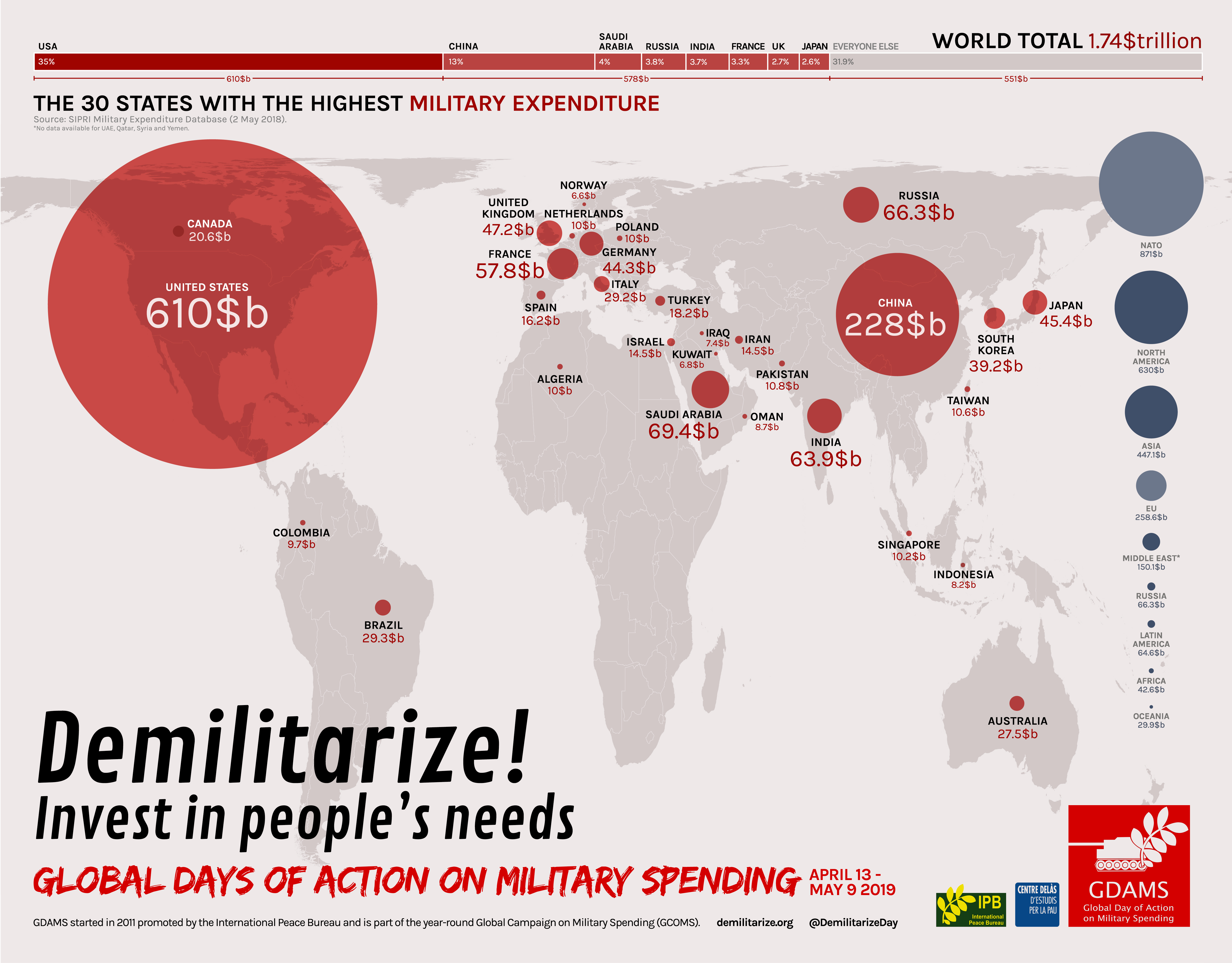
The first one draws data from SIPRI’s Military Expenditure Database and shows through bubbles on a world map the 30 states with the highest military expenditure. It also displays military expenditure by regions, adding also NATO and the EU. On the upper side, a bar graphic shows the world total (1,82 trillion USD for 2017), and the proportion of this represented by the U.S. (649$b –more than a third), the 7 next biggest spenders (another third) and everyone else (the last third).
Also in Spanish, French, Italian, Catalan and Finnish.
This infographic was first created with figures for the year 2017, and was updated with figures for 2018 after SIPRI released the new data on April 29 2019.
You can download the infographic with data for the year 2017 here.