Infographic Arms Transfers GDAMS 2019
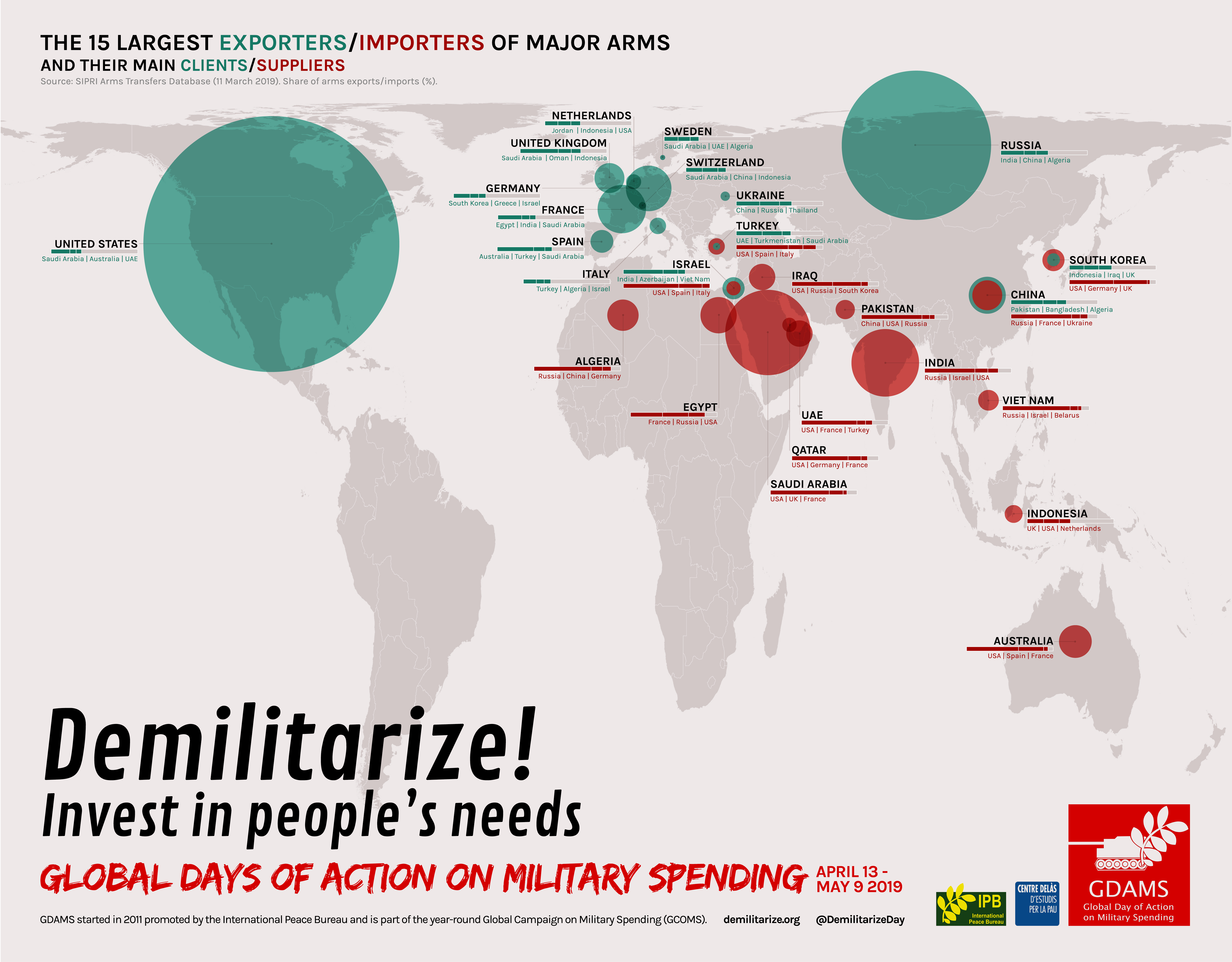
The second infographic uses data from SIPRI’s Arms Transfers Database, updated in March 2019. It displays through bubbles on a world map representing proportionally the 15 largest importers and exporters of major arms.
It seemed relevant to us how the biggest exporters (in turquoise) are mostly in Northern countries and how importers (in red) are mainly in the South. Weapons flow therefore from North to South, which proves the the responsibility of Northern exporters in tensions and conflicts around the world, that ultimately generate enormous suffering and instability.
The infographic also displays in a bar below the name of each country its 3 main clients/suppliers, in relation to the total. This intends to show connections among countries and to point fingers at those states selling weapons to others involved in conflicts, tensions and/or systematically violating human rights.